
E-publishing for e-readers involves a bit more than merely printing to a PDF—at least if you want a professional-looking result. As always though, open source can help you get from here to there.
With Sony e-readers, Kindles, Kobos, Nooks, iPads, smartphones and the new Nintendo handhelds all giving you the ability to read on the go without having to cart around a stack of paperbacks, the e-book market is growing like an alien embryo in a doberman. All the major stores allow independents to list with them, and the result is, not surprisingly, a lot of books that look like they weren't edited or typeset at all. Ever seen a blog with no theme, where the text is blocky with no indents or proper spacing? A lot of these books look like that.
All these devices have created a demand for content, which means that, as with HTML in the early days of the Web, there's a demand for people who can make it look good. There also are independent-minded folks who are determined to do their own typesetting rather than contracting out the work, even if it means shelling out a lot of money for programs with which to do it.
But, this is open source, that wonderful corner of the world where we don't need no stinking proprietary programs. When it comes to e-books though, every e-reader device has its own proprietary format. EPUB is the available open standard, and being an open standard, it's pretty easy to migrate from EPUB to other formats for other readers (some retailers even will do that dirty work for you). First though, you have to make an EPUB, which looks from the outside like a nontrivial task.
It turns out there are about a dozen different ways to make an e-book on Linux, from OpenOffice.org templates and extensions to HTML-to-EPUB conversion utilities. You can use Scribus to lay out your e-book, export to PDF, convert to HTML and convert from there to EPUB. You even can hand-code the thing.
If you're not familiar with the difficulties and advantages of each approach, the decision can mean making a choice blindly. Covering all the options in detail would take a lot more space than I have in this article, so I concentrate on a method that exposes the underlying structure of the e-book for fine tinkering while using a GUI that streamlines the process.
E-book authoring essentially is a layout and design process that uses HTML and CSS to create the final output, which is a limited subset of XHTML and XML. This final output is all stuffed into a single zip file and is designed to be widely readable. Because of this, working with it can be just different enough from hand-coding vanilla HTML to become maddening. Nonetheless, to create a proper e-book, you need, at minimum, the following:
Hierarchical arrangement of content.
Clickable tables of contents.
Any graphics should be anchored inline with flowing text.
The ability to use tables.
The ability to use indents. (It may seem like a strange item to be on the list, but one of the most obvious markers of an amateurish e-book is lack of indentation.)
After a lot of tinkering, I settled on a work flow that seems to work well for most purposes—an exception may be textbooks and other nonfiction works that have highly complex layout requirements. Although I suspect that this work flow may accommodate such projects, I can't say with confidence that it will scale that far. There is, of course, one way to find out.
First things first, laying out your e-book is not the same thing as writing it. Word processors and writing programs like CeltX have tools designed to make certain types of writing easier to manage—take advantage of them.
If you want your e-book to look good, start with a solid, clean manuscript that won't require editing when you get to the other side. Forget headers and footers—they don't translate. There is a way to do them in EPUB, but it's an optional part of the standard that most e-readers haven't implemented yet, so it's rarely worth the trouble.
As I'm writing this, the internal structure of EPUB files is difficult to manage in OpenOffice.org and other word processors, particularly with longer documents. So, although OpenOffice.org has some extensions to let it export EPUB, it's much quicker and cleaner to do the layout in a different program.
For our purposes here, I've chosen Sigil, a purpose-built e-book editor that works very much like Quanta and other Web-authoring suites. Although it's still in its early days, it seems fairly solid, isn't crash-prone, and every tool included in the stable release works as advertised.
Once you have a clean manuscript in your word processor, export it to HTML.
To follow along with the rest of this how-to guide, you need Sigil. The program plays nice with newer distros in its binary form, and it's a breeze to build from source. You can find everything you need (including detailed install and build instructions) at code.google.com/p/sigil.
Once installed, run the program. It should work without a hitch, but if it fails to start, chances are you don't have a current-enough version of libstdc++. If this is the case, you need to go back and install from source. The rest of us will wait here and mock your name for not reading the dependencies list while you catch up.
Sigil will open up looking something like Figure 1. Begin by importing the HTML of your book using the option under the file menu. Once done, the fun begins.
Figure 1. Sigil Opening Screen
The program has a few basic formatting tools. You can control paragraph spacing, chapters and so on very simply with the GUI tools, and I explain how to use them and the structural tools in a bit.
Like most WYSIWYG HTML editors, Sigil lets you edit the preview of your document directly. If you press the icon with the book and the brackets (Figure 2), it gives you split-window access to the underlying markup and CSS. (And, for purposes of brevity in this article, I'm forced to assume that you know the basics of HTML and CSS. If you need to get the basics, see www.w3schools.com or any one of a hundred other good, free resources on the Web.)
Figure 2. Toolbar Button to Show Underlying HTML and CSS
You'll notice that your imported HTML looks blocky—you've probably lost all your indents, although it's preserved your bolds and italics—and it just looks and feels boring. Well, we're going to fix all that.
The experience of reading on an e-reader is a mid-point between a paperback and a Web page, but the appeal of an e-book is that it delivers a more paperback-like experience than reading on an LCD without the bulk of an actual paperback.
There are a few layout conventions that differentiate a book from a Web site, and ignoring them gets you, at best, an e-book that looks like a vanilla text file with better fonts. (For a resource on good book layout conventions, see www.members.shaw.ca/nathanieldesign/book_layout.htm).
And, now that I've mentioned fonts, let's start there. The standards for the Web are Arial and Helvetica. They're clear, sans serif and easy to read even on poorly designed Web sites and dim screens. Aesthetically ennobling, they're not. Bare functionality is the name of their game, and they do it remarkably well. For e-books, however, you want a font that mimics the aesthetic of a paper book, so you'll want to use a proportional serif font like Garamond, Times New Roman or New Century Schoolbook. To set the font, edit the CSS like you would for a Web site to specify the font you need.
You also want to make sure your paragraphs are properly indented. If you're converting an OpenOffice.org .odt file to HTML, you're going to lose your tab-based indentations. The reason? In HTML, a tab means precisely nothing. The only way to get indentations in your e-book properly is to build them into the CSS. Using margin controls to do it in OpenOffice.org will put the CSS into your exported HTML, but you also can use the following code to indent a paragraph:
<p class="sgc-2"> paragraph </p>
Another little touch often used, particularly in novels, is the drop cap—the large, often stylized capital letter that begins the first paragraph of a chapter. You can do this too, in HTML, by applying the following to your CSS:
.dropcap {
    float: left;
    font-size: 3em;
    line-height: 1;
    font-weight: bold;
    margin-right: 0.2em;
}
Once applied, you can use a <span class="dropcap"> tag to implement your drop cap wherever you see fit (Figure 3).
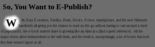
Figure 3. Drop Cap CSS in Action
Finally, there's the thorny issue of inline images. Like HTML, EPUB is a flowing-text format rather than a fixed-text format. And, like HTML, it's designed that way to accommodate a variety of screen sizes, so that the customer doesn't get tied to a single device. Anchoring images, thus, can become a bit of a problem if you use the wrong method.
The <img> tag tells the interpreter where to place your graphic depending on the align option—if you don't tell it, it just drops the image in as an inline element as if it were another character. Normally on a Web site, you can use top, bottom, left, right and center as your alignment options. You still can use those here, although top, bottom and center tend to look pretty ugly when used in an e-book, so I highly recommend using only align="left" and align="right" if you want the project to look good.
For reference, the EPUB standard supports PNG, JPG, GIF and SVG. Because it's a vector format, SVG is the only one of these that scales well, so I recommend using it for diagrams whenever possible. When sizing PNG, JPG and GIF, bear in mind that most e-book readers are comparatively low resolution, so you can use them at slightly more than Web-appropriate sizes without too much worry.
Finally, there are pull-quotes (Figure 4). To pull these off, you'll need a little CSS and a little HTML. The CSS defines the pull-quote class, and it goes something like this:
.pquote {
    float: left;
    width: 8em;
    background: #ddf;
    font-weight: bold;
    padding: 1em;
    margin: 0 0.5em 0.5em 0;
}
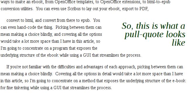
Figure 4. Pull-Quotes
Then, to use the pull-quote inline, use this HTML:
<blockquote class="pquote"> pull quote text </blockquote>
Tables, the last thing in on the layout checklist, are the easiest to manage—simply put them into the code screen the way you would any HTML tables, and they will render beautifully inline.
The other major defining characteristic of a professional-feeling e-book is the internal structure. One of the major tools authors use to control the timing and flow of their prose is structure—page breaks, chapter breaks and so on. In e-books, which are generally a flowing-text format, you use internal data structure to reproduce similar effects. A clickable table of contents, hard breaks between the chapters and end notes where applicable are the bare minimum.
The complicated procedures one must go through to create this structure when exporting from OpenOffice.org via its available extensions (and this experience is typical of most free authoring solutions) is the reason that the commercial products on the market tend to sell for upward of $100–$200. This is where Sigil shines. It makes short work of this otherwise most annoying part of the process.
The first thing you'll want to appear in your e-book is the artwork. Move your cursor to the beginning of your text, and from the Insert drop-down menu, select Image. For optimal results across readers, you want cover art that is 590 wide x 750 high, 72ppi or higher resolution, saved in the RGB colorspace. JPG, GIF and PNG are all supported in the standard for cover art.
Next, to tag the art as your cover art, you need to go to the left sidebar, find the cover art image in the Images folder for the project and right-click on it. A menu will pop up. From the menu, select Add Semantics and click on the submenu option Cover art. This will set the tags in the book properly. Now, back in the main editing pane, position your cursor directly after the art, and press Ctrl-Enter. This creates a chapter break so that the image will display as a single-pane page on reader devices.
With the cover art done, it's time to create the rest of the internal structure. At every chapter break (or anywhere you want a hard break in the book), create another chapter in the e-book with Ctrl-Enter. You'll notice that, as happened with the artwork, each Ctrl-Enter creates a new tab, numbered serially.
Once you have broken all your chapters, it's time to create a table of contents. Start with your chapter headings (for example, “Chapter 1”). Highlight the text for your heading, then, in the Select Heading list box, select Heading 1. Do this for every chapter heading. For more complex documents, use Heading 2 and onward down the hierarchy—this will create an outline when you autogenerate the table of contents.
To autogenerate, go to the Tools menu, and select TOC Editor. Here you can decide which chapter breaks to include in the clickable table of contents, and you can edit the chapter titles as they will appear in that table of contents. Once you're satisfied with the way it looks, the last thing you need to do is create the metadata to display on your e-book reader's index.
Under Tools, select Meta Editor. In the window that pops up, fill in the title, author and language. Use the Add Basic and Add Advanced buttons to add other relevant fields, such as the ISBN, publication dates, genres and so forth. And, believe it or not, you're done.
Because of the way e-book authoring works, defining the style that suits your particular book is far easier than it looks at first glance. A passing familiarity with CSS and HTML should be enough to allow you to create eye-catching layouts with transitional artwork and all the trimmings. Several enterprising folks, such as the group at EPUB Zen Garden (epubzengarden.com/contribute) have released professional book templates for noncommercial use, and a number of others are selling good layout templates. Of course, with a good eye, a bit of patience and the tools described in this article, you can give your e-books their own unique look for only the cost of your own labor and expertise.
